2.5 Visualization
A graph is a set of points. A mathematical graph cannot be seen. It is an abstraction. A graphic, however, is a physical representation of a graph. This representation is accomplished by realizing graphs with aesthetic attributes such as size or color. (Wilkinson 2005, 6)
Visualization is the process of representing information or ideas through diagrams, graphics, and other methods of visual presentation. In general, visualization tools should be clear to the reader and unnecessary details should be avoided. A good viewer conveys the desired information clearly, accurately, and efficiently.
According to (Kopf 1916), besides “forty years of thought and achievement in the Indian question” (Walker 1874), “safeguarding the health of the British soldier”, “reorganizing civil and military hospital administration at home and abroad” and “her pioneer services to the profession of nursing”, the activities of Florence Nightingale in statistics “may be classed under several broad categories”. “The Lady with the Lamp”, a “passionate statistician” according (E. Cook 1913), popularized the polar-area diagram, what she called “coxcombs” (Cohen 1984). Moreover, she did an outstanding job on the visualization part in documenting information relating to the war fronts (Nightingale 1858).
Edward Tufte, “the Leonardo da Vinci of data” according to The New York Times, or “the Galileo of graphics”, according to (Tufte et al. 1998), Bloomberg, has a vast body of work on the subject, highlighting (Tufte 1993), (Tufte 2006) and (Tufte 2020). More recently, visual artists such as Karim Douieb14 can be found, who has a considerable published portfolio.
Based on (Tufte et al. 1998), (Tufte 1993) and (Cleveland 1985), (Cleveland 1993), Rob Hyndman suggests 20 Rules for Good Graphics.
- Use vector graphics such as eps or pdf.
- Use readable fonts.
- Avoid cluttered legends.
- If you must use a legend, move it inside the plot.
- No dark shaded backgrounds.
- Avoid dark, dominating grid lines.
- Keep the axis limits sensible.
- Do not forget to specify units.
- Tick intervals should be at nice round numbers.
- Axes should be properly labeled.
- Use linewidths big enough to read.
- Avoid overlapping text on plotting characters or lines.
- Follow Tufte’s principles by removing clutter from graphs and maintaining a high data-to-ink ratio.
- Plots should be self-explanatory.
- Use a sensible aspect ratio.
- Use points not lines if element order is not relevant.
- Use lines if element order is relevant (e.g., time).
- Use common scales for comparison (or a single plot).
- Avoid pie-charts. Especially 3d pie-charts. Especially 3d pie-charts with exploding wedges.
- Never use fill patterns such as cross-hatching.
2.5.1 Examples
Example 2.41 Visualization considering the aforementioned principles.

by Max Roser at ourworldindata.org/longtermism
- It is these 109 billion people we have to thank for the civilization that we live in. The languages we speak, the food we cook, the music we enjoy, the tools we use – what we know we learned from them.
- Max Roser (2022-03-15)
Example 2.42 Land doesn’t vote. People do.15
I have the feeling my map is becoming for the US elections what's the @MariahCarey's song "All I want for Christmas is you" has become for the holiday season... https://t.co/5Z2VrsgdTA
— Karim Douïeb (@karim_douieb) November 12, 2022
Example 2.43 Would bicycles be the transport of the future invented in the past?16
Works in Rotterdam too :) pic.twitter.com/UFbOxEx4Yb
— Wouter Stern (@Twouttter) March 15, 2023
Example 2.44 According to (Zabala 2009), if there are three candidates on the verge of a technical tie according to the method adopted by research institutes – i.e., \(A\) ties with \(B\) by one point, \(B\) ties with \(C\) by a point but \(A\) and \(C\) do not tie (??) –, the blue ellipse in the simplex below indicates the likely electoral scenarios with a sample size of 500. In this case, there must be a second round between \(A\) and $ B$.
2.5.2 Basic charts
2.5.2.1 Pie
The idea is to draw sectors/slices proportional to the frequencies of the categories. Following the graphic presentation etiquette, it is recommended to use this type of graphic for a maximum of ten categories. Also, by default displayed counterclockwise starting at 0°.
atend <- c(90,62,31,44,13)                      # Number of attendances
colors <- gray(0:4/4)                           # Five shades of gray
atend_rel <- round(atend/sum(atend) * 100, 1)   # Calculating the percentages
atend_rel <- paste(atend_rel, '%', sep='')      # Adding '%'

# Frequency
pie(atend, main = 'Attendances', col = colors, labels = atend,
    cex = 1.2, cex.main = 1.7)
legend(1.1, 0.9, c('Mon','Tue','Wed','Thu','Fri'), cex = 1.3, fill = colors,
       box.col = 'white')
# Relative frequency
pie(atend, main = 'Attendances', col = colors, labels = atend_rel,
    cex = 1.2, cex.main = 1.7)
legend(1.3, 0.9, c('Mon','Tue','Wed','Thu','Fri'), cex = 1.3, fill = colors,
       box.col='white')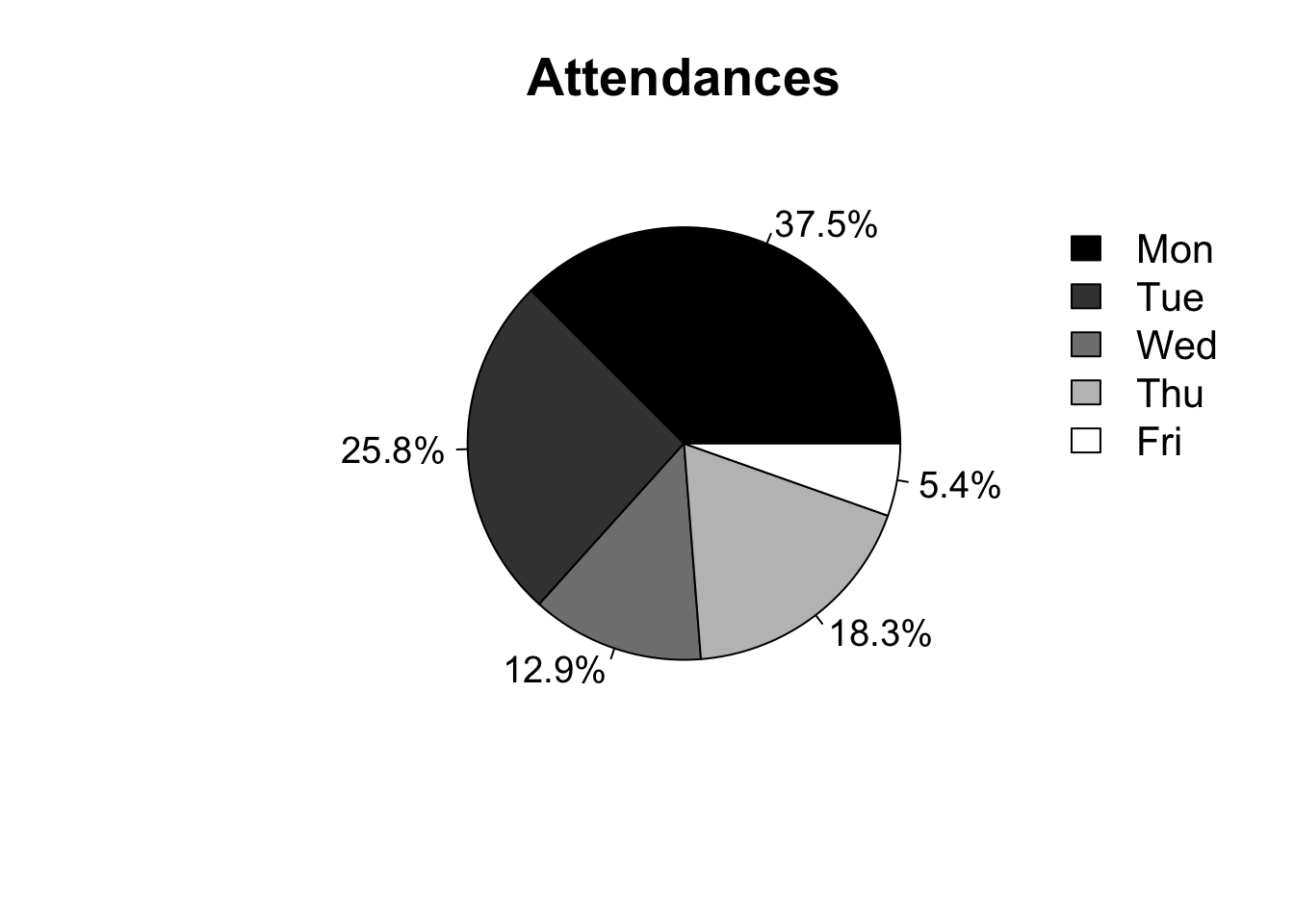
2.5.2.2 Bars and Columns
The bar chart is typically used to display data sorted into unordered categories. Rectangular bars of the same width are placed over the categories with height proportional to the frequencies or other measure associated with the categories. They can be arranged horizontally or vertically; when grouped in the latter way, it is called a column chart. It is a very diversified graph, as it allows you to represent information in different ways.
# Data
expenses <- c(760, 640, 75, 850, 100)
names(expenses) <- c('education', 'food', 'electricity', 'housing', 'internet')

# Bars
barplot(expenses, xlab = 'Expenses (R$)', main = 'Personal expenses',
        col = gray(0:4/4), las = 0, cex.main = 1.6, horiz = TRUE)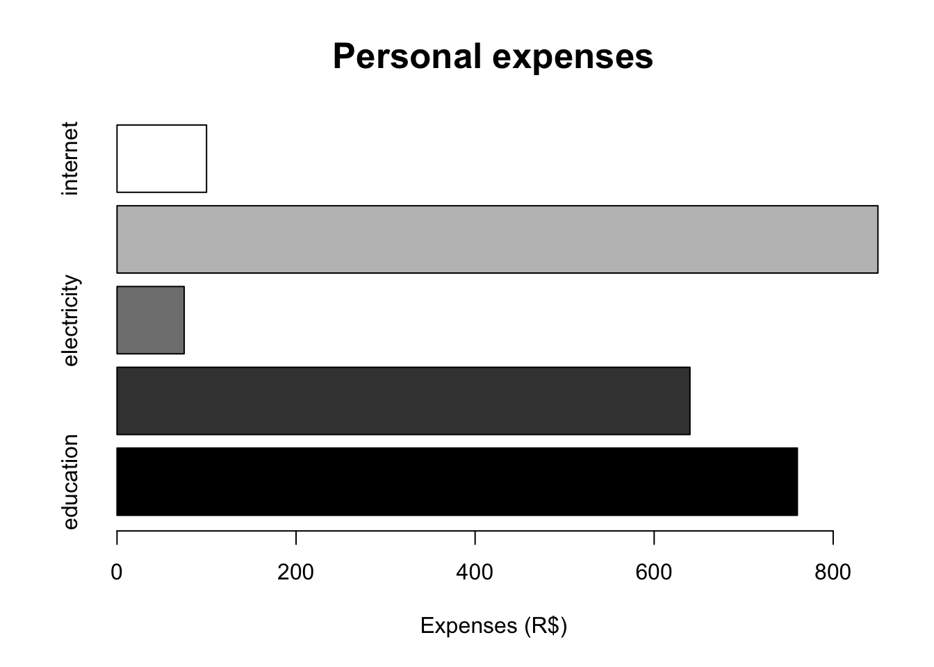
# Columns
barplot(expenses, ylab = 'Expenses (R$)', main = 'Personal expenses',
        col = gray(0:4/4), las = 0, cex.main = 1.6)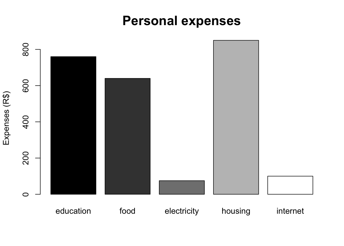
# Stacked columns
library(vcd)
tr <- table(Arthritis$Improved, Arthritis$Treatment)
rownames(tr) <- c('No improvement', 'Some improvement', 'Full improvement')
colnames(tr) <- c('Placebo', 'Treatment')

barplot(tr,
        main = 'Placebo vs Treatment',
        ylab = 'Frequency',
        col = c('black', 'grey', 'white'),
        cex.main = 1.6)
legend(1.5, 40, rownames(tr), cex = 1, fill = colors[c(1,3,5)],
       box.col = 'white')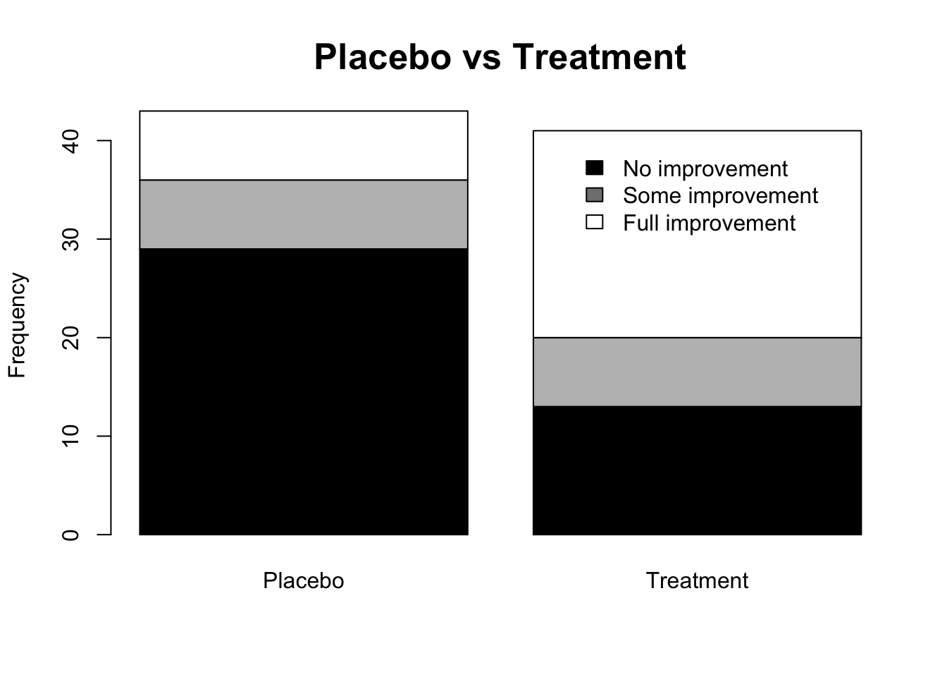
# Columns side by side
barplot(tr,
        main = 'Placebo vs Treatment',
        ylab = 'Frequency',
        col = c('black', 'grey', 'white'),
        cex.main = 1.6, beside = TRUE)
legend(4, 28, rownames(tr), cex = 1, fill = colors[c(1,3,5)],
       box.col = 'white')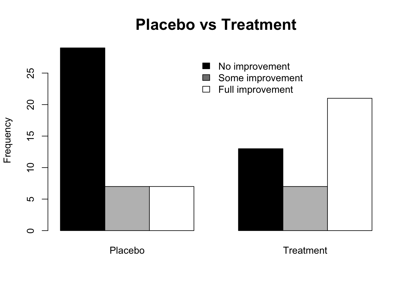
2.5.2.3 Histogram
The histogram is the classical nonparametric density estimator, probably dating from the mortality studies of John Graunt in 1662. (Scott 1979, 605)
The histogram is a bar graph without spacing used to represent frequency distributions of continuous variables. The term was introduced by Karl Pearson “in his lectures on statistics as a term for a common form of graphical representation, i.e., by columns marking as areas the frequency corresponding to the range of their base”. (Pearson 1895, 399)
The variable divided into classes on the horizontal axis (\(x\)) and the frequency of each class on the vertical axis (\(y\)) are presented. Computational packages in general define the number of classes by the Sturges rule according to Eq. (2.3). It is a basic exploratory data analysis tool to assess data dispersion and shape, detect outliers, and suggest models and transformations for more advanced analysis.
# Data
h <- read.csv('https://filipezabala.com/data/hospital.csv', header = TRUE)
# Standard histogram
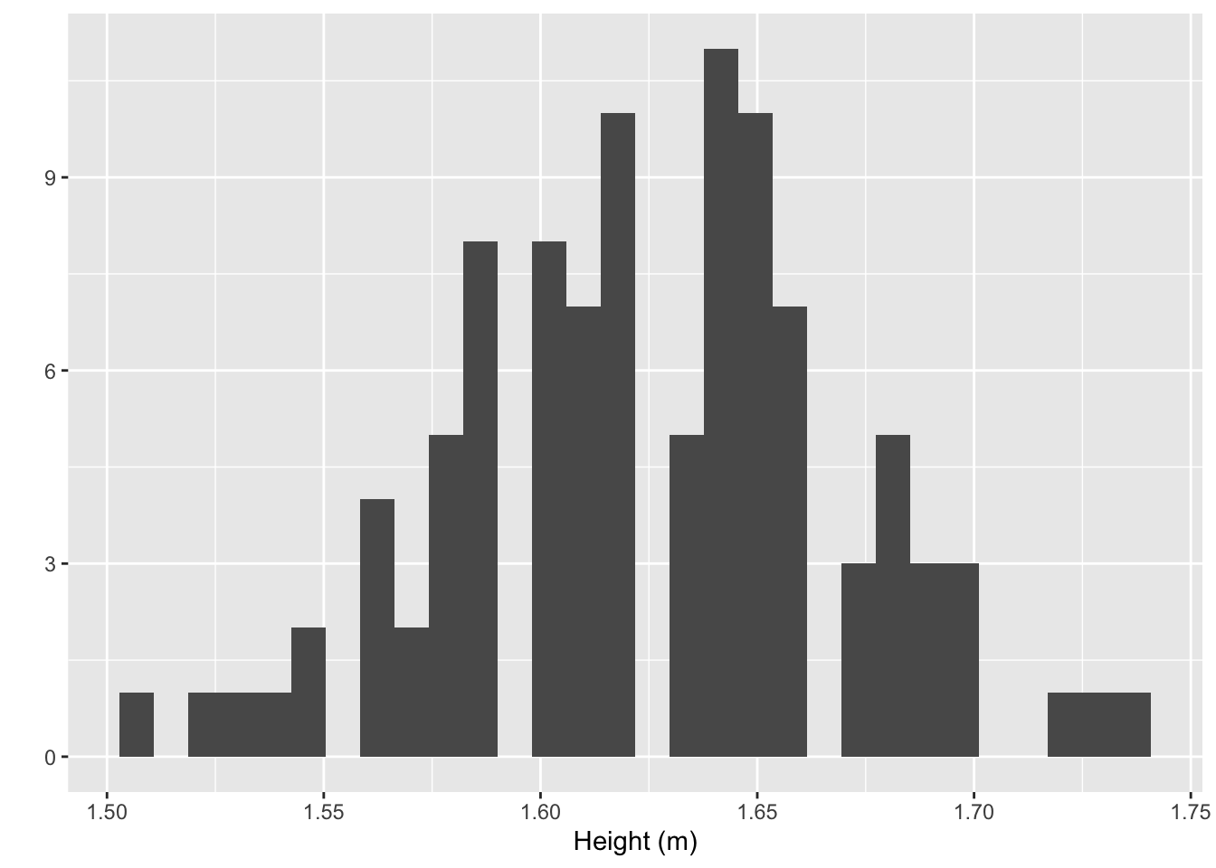
hist(h$height, prob = FALSE, right = FALSE, breaks = 'sturges', main = '',
xlab = 'Height (m)', col = 'grey')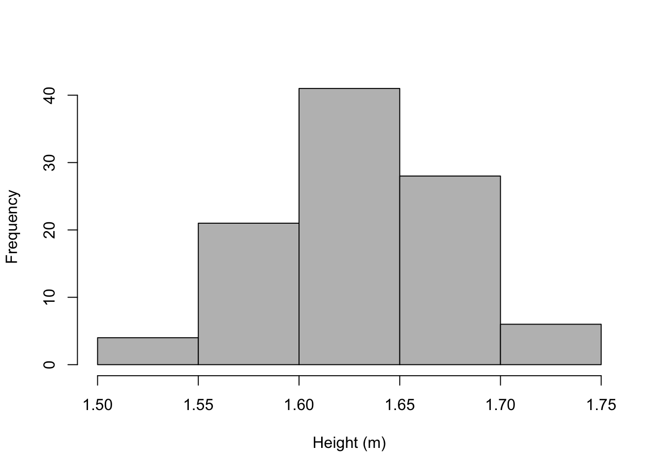
# Freedman-Diaconis class interval
hist(h$height, prob = TRUE, right = FALSE, breaks = 'fd', main = '',
     xlab = 'Height (m)', col = 'grey')
# Adjusting theoretical normal
curve(dnorm(x, mean = mean(h$height), sd = sd(h$height)), col = 'blue', lwd = 2,
      add = TRUE)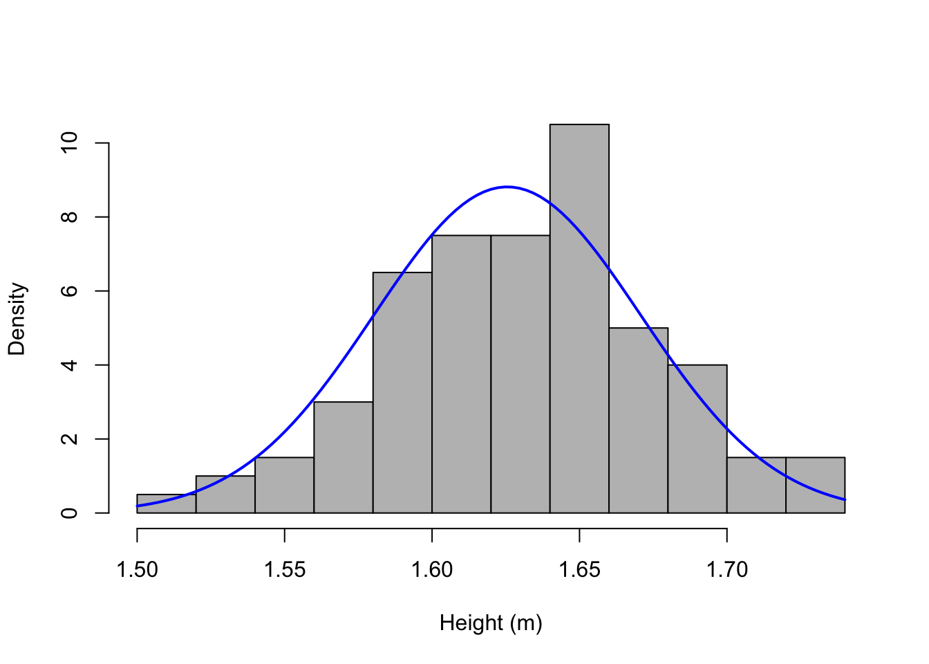
2.5.2.4 Boxplot
Introduced by (Tukey 1977), the boxplot is a graph in rectangular format bounded by the first and third quartiles, where the center line is the median. The distance between quartiles is the interquartile range as per Section 2.4.4 and includes \(50\%\) of core data. Points exceeding \(1.5\) times the interquartile range above (below) \(Q_{3}\) (\(Q_{1}\)) are called outliers. Variations are discussed by (McGill, Tukey, and Larsen 1978), (Benjamini 1988) and (Esty and Banfield 2003).
# dados
h <- read.csv('https://filipezabala.com/data/hospital.csv', header = TRUE)

# Boxplot
boxplot(h$children, main = 'Children', ylab = 'Children',
        las = 1, cex.main = 1.6)
legend(1.32, 0.1, 'Minimum', box.col = 'white')
arrows(x0 = 1.35, y0 = 0, x1 = 1.25, y1 = 0, length = 0.15)
legend(1.32, 1.1, 'Q1', box.col = 'white')
arrows(x0 = 1.35, y0 = 1, x1 = 1.25, y1 = 1, length = 0.15)
legend(1.32, 2.1, 'Median', box.col = 'white')
arrows(x0 = 1.35, y0 = 2, x1 = 1.25, y1 = 2, length = 0.15)
legend(1.32, 3.1, 'Q3', box.col='white')
arrows(x0 = 1.35, y0 = 3, x1 = 1.25, y1 = 3, length = 0.15)
legend(1.32, 6.1, 'Maximum', box.col = 'white')
arrows(x0 = 1.35, y0 = 6, x1 = 1.25, y1 = 6, length = 0.15)
# Proportional to group size
set.seed(1); y <- c(rpois(50, lambda=1.5), rnorm(300,4), (1:150)/17)
x <- factor(c(rep('A',50), rep('B',300), rep('C',150) ))
bp <- boxplot(y ~ x, varwidth = TRUE, las = TRUE, main = 'Variable W',
              cex.main = 1.6)
mtext(paste('(n=', bp$n, ')', sep = ''), at = seq_along(bp$n), line = 2,
      side = 1)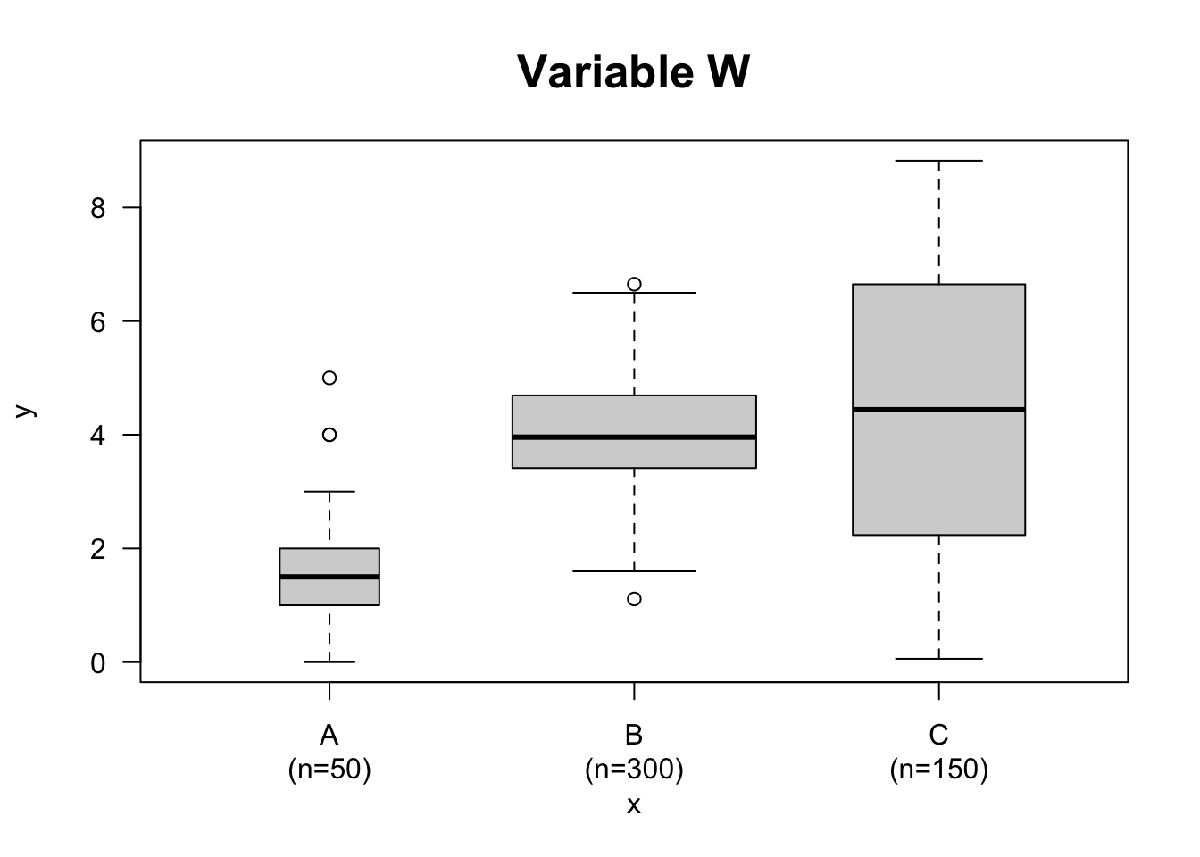
# Vertical
boxplot(count ~ spray, data = InsectSprays, col = 'lightgray',
        main = 'Score on a test', ylab = 'Score', xlab = 'Group',
        las = 1, cex.main = 1.6)
legend(2.85, 18.5, 'Outliers', box.col = 'white')
arrows(x0 = 3.4,y0 = 15, x1 = 3.05, y1 = 7.8, length = 0.15)
arrows(x0 = 3.4,y0 = 15, x1 = 3.9, y1 = 12.3, length = 0.15)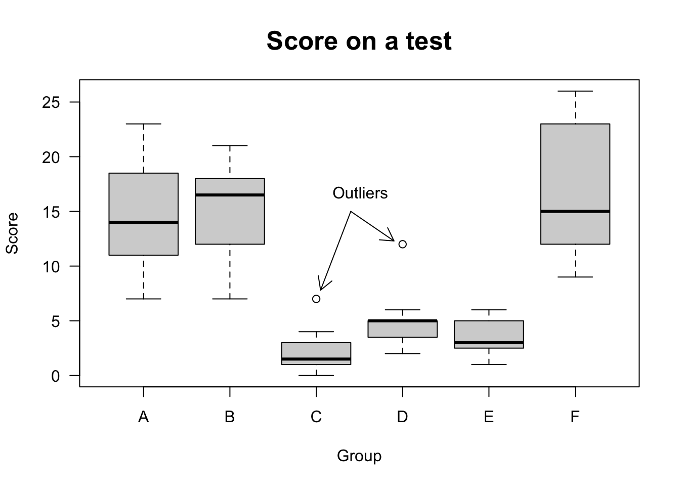
# Horizontal
boxplot(count ~ spray, data = InsectSprays, col = 'lightgray',
        main = 'Score on a test', ylab = 'Score', xlab = 'Group',
        las = 1, cex.main = 1.6, horizontal = TRUE)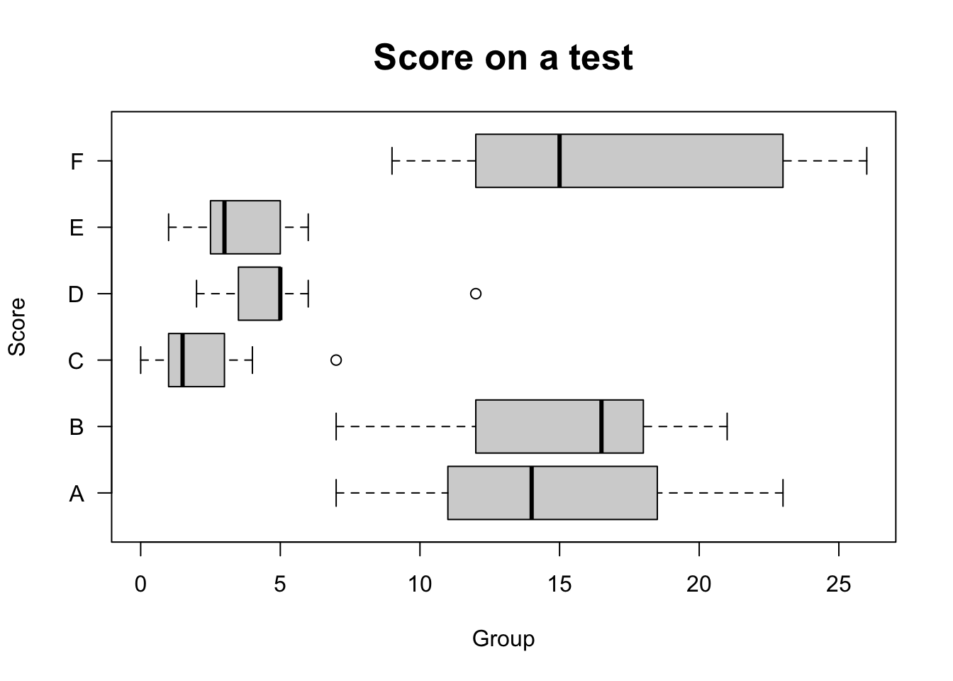
2.5.2.5 Scatter plot
The scatter plot shows the relationship between two numeric variables. It is a useful tool for adjusting the models presented in Chapter 7.
performance <- 0.42515199183708*mtcars$mpg
weight <- 0.453592*mtcars$wt*1000
displacement <- 16.387064*mtcars$disp
rear_axle_ratio <- mtcars$drat

# Scatter plot
plot(weight, performance,
     main = 'Performance (km/L) vs Weight (kg)',
     xlab = 'Car weight (kg)',
     ylab = 'Performance (km/L)',
     pch = 19, las = 1, cex.main = 1.6)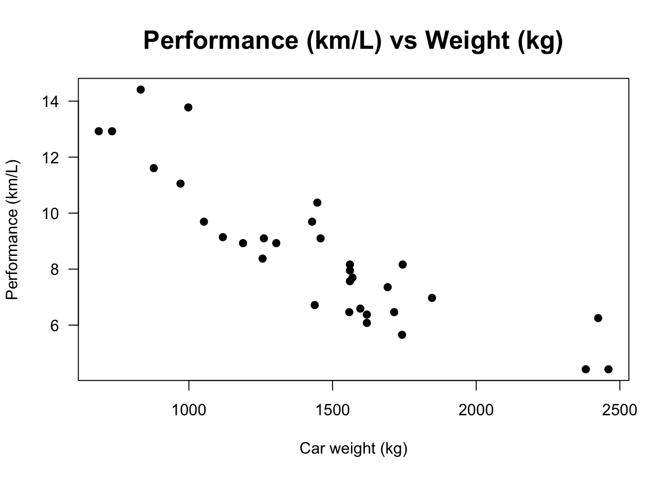
# Scatter matrix
pairs(~ performance + weight + displacement + rear_axle_ratio,
      main = 'Scatter matrix', cex.main = 1.6)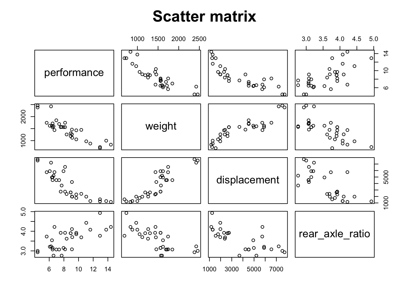
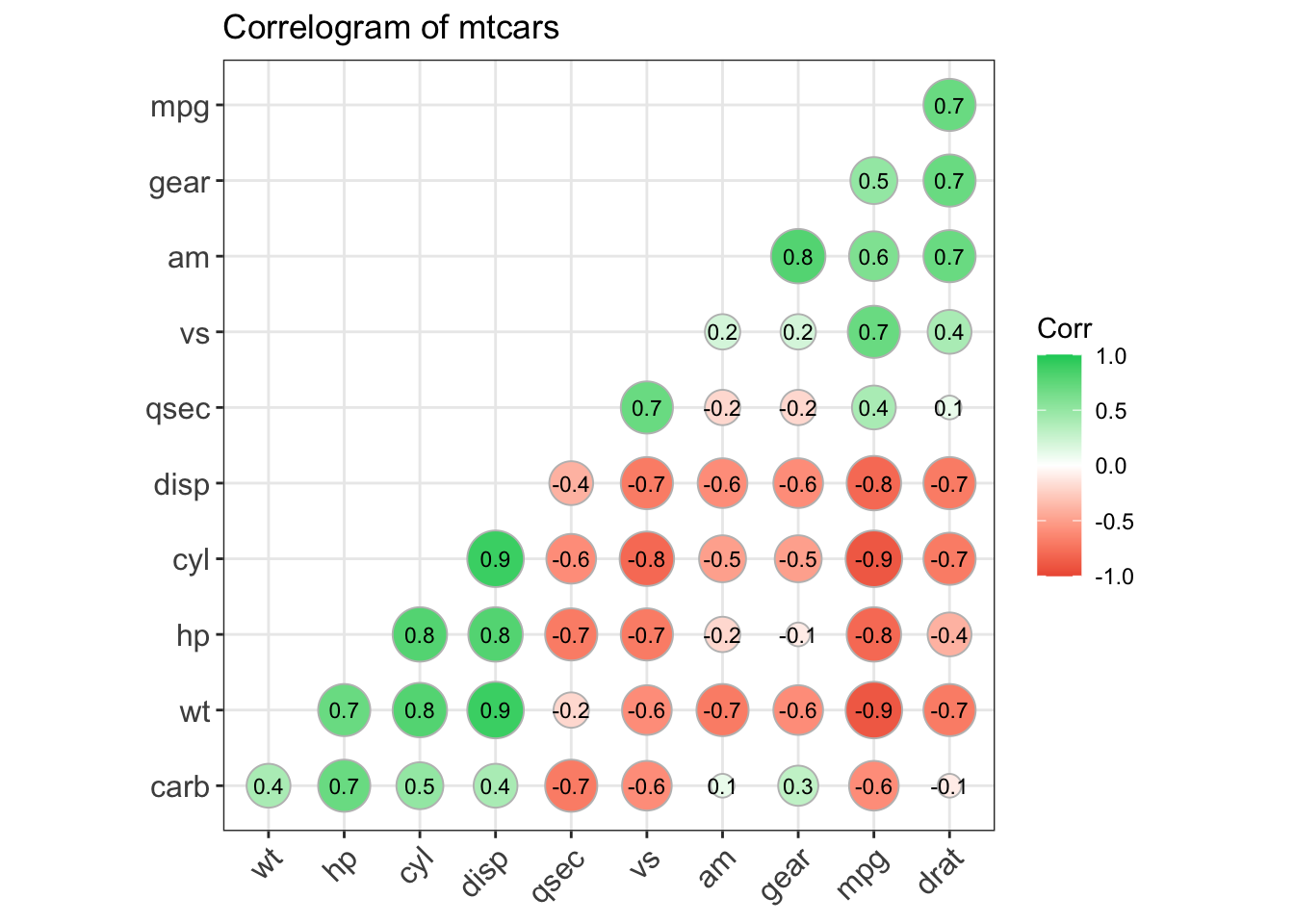
2.5.2.6 Correlogram
Adapted from http://www.r-graph-gallery.com/97-correlation-ellipses/.
# install.packages(c('ellipse','RColorBrewer'), dep=T)
library(ellipse)
library(RColorBrewer)

# Using the 'mtcars' database
data <- cor(mtcars)

# 100 color panel with Rcolor Brewer
my_colors <- brewer.pal(5, "Spectral")
my_colors <- colorRampPalette(my_colors)(100)

# Sorting the correlation matrix
ord <- order(data[1, ])
data_ord <- data[ord, ord]
plotcorr(data_ord , col=my_colors[data_ord*50+50] , mar=c(1,1,1,1))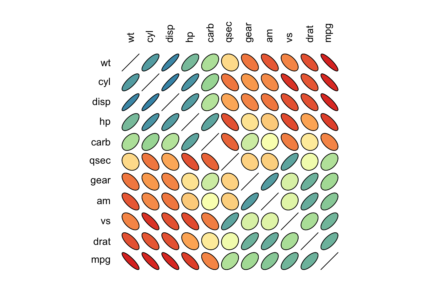
Adapted from http://r-statistics.co/Top50-Ggplot2-Visualizations-MasterList-R-Code.html#Correlogram.
# devtools::install_github("kassambara/ggcorrplot")
library(ggplot2)
library(ggcorrplot)

# Correlation matrix
data(mtcars)
corr <- round(cor(mtcars), 1)

# Plot
ggcorrplot(corr, hc.order = TRUE,
           type = 'lower',
           lab = TRUE,
           lab_size = 3,
           method = 'circle',
           colors = c('tomato2', 'white', 'springgreen3'),
           title = 'Correlogram of mtcars',
           ggtheme = theme_bw)